
Kwikset's app was built for one thing: smart locks. When they partnered with Amarr, they brought a garage door opener into the same ecosystem. My job was to design that experience end-to-end, including building CarPlay support from scratch.

My goal here wasn't just adding a feature for a garage door opener, it was making garage door control feel like it had belonged in the app all along.
My goal here was to add a companion for the Kwikset app. Despite the constraining guideline for CarPlay and Android Auto, I managed to create something that feels seemless and to brand standards.
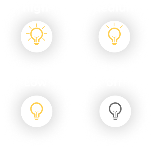
The preset controls was a must have feature from Amarr, the partner company that was providing the garage door opener. It needed to feel effortless but "effortless" means different things to different users. My first design let users press, hold, and drag to their preset, a gesture our lead loved for how clean it felt.
However, a large share of our users are on the elderly side, and drag gestures aren't always intuitive at that end of the spectrum. Combined with a tight development timeline, we pivoted to a simpler flyout: press to open, move a toggle, confirm. It added a step but tested easier for a wider range of users, even though some still preferred the original's simplicity.
.png)
Although the first design was slick and innovative as far as the brand goes, the flyout control aligns better with what the existing app already has and is easier to use for the majority of its existing users.
.png)
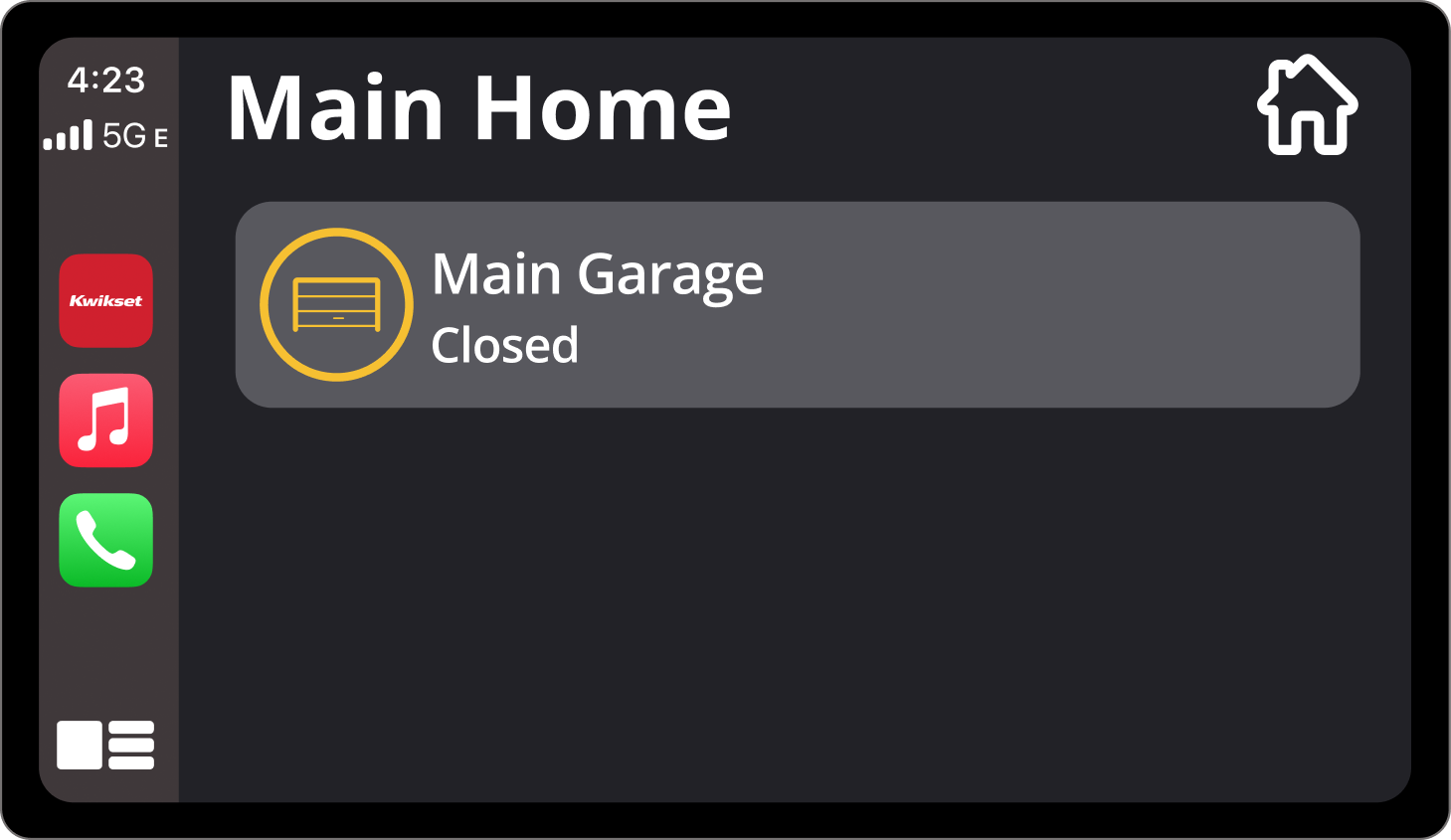
CarPlay & Android Auto meant designing for a context most apps never touch: a driver who can't look at their phone. Although Apple and Google had slightly different guidelines, the core perpose was universal. The main rule, and a strict one for good reason, was safety.
The final design was very simple, just open and close, no extra features and no distracting visuals. Safety over feature parity.
Do to unforseen circumstances, my contact had to come to an end and some main issues and updated were not addressed. If I was still working on this project, here as some things I would work on: